
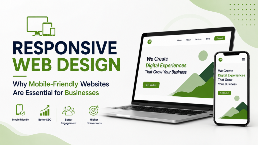
So, most people find your business through Google, social media, ads, or someone recommending you. Usually, that first visit happens on their phone. If your website is hard to use, slow to load, or the buttons are too small, people will just leave before they even figure out what you do.
That’s why responsive web design isn’t just a nice-to-have anymore. It’s basic hygiene for any business website.
A responsive website just means your site adjusts itself for any screen-phone, tablet, laptop, whatever. You don’t need two separate sites. One site, one experience, everywhere.
For businesses, this isn’t just about design. A mobile-friendly website directly affects how easy it is for people to use your site, how you show up on Google, whether people trust you, and if they actually become leads or customers.
What Is Responsive Web Design?
Responsive Web Design is an approach to website development where the website layout adjusts according to the device and screen size being used.
Consider a desktop website with:
A horizontal navigation menu
Three-column sections
Large images
Multiple content blocks
Side-by-side forms and text
If you just squeeze your desktop site onto a phone, it won’t work. Text gets tiny, buttons are hard to tap, and people have to scroll forever to find what matters.
Responsive design fixes this by automatically rearranging everything so it actually works on a phone.
For example:
Desktop:
Three columns → navigation across the top → large content sections
Mobile:
Single column → simplified navigation → appropriately sized images → touch-friendly buttons
The goal is simple: make your website easy to use, no matter what device someone is on.
Why Businesses Need A Mobile-Friendly Website
1. Customers Browse Across Multiple Devices
People do not necessarily follow one fixed path when researching a business.
Someone may discover a company through their phone, visit the website later from a laptop, and return to their smartphone when they are ready to contact the business.
A Mobile-Friendly Website ensures that the customer experience remains consistent across these interactions.
This matters even more if your business relies on enquiries, bookings, sales, or calls from your website.
2. Mobile Users Expect Easy Navigation
Mobile screens are small, so you have to be smart about what goes where.
Important elements such as:
Contact buttons
Navigation
Forms
Product information
Service details
Calls to action
These should always be easy to spot and use.
A good responsive layout tweaks spacing, font size, images, and menus based on the screen size.
3. Better User Experience Can Support Conversions
A website’s purpose is usually more than displaying information.
For a service business, the desired action could be:
Website Visit → Service Page → Enquiry → Consultation
For an e-commerce business:
Product Discovery → Product Page → Cart → Checkout
If your mobile site makes any of these steps hard, people will just drop off.
Responsive design cuts out friction and makes everything easier to use on a phone.
Responsive Design And SEO
Actually, website design and SEO go hand in hand.
Search engines need to crawl and understand website content, while users need to access that content easily. A responsive website provides a consistent URL and content structure across devices, making it easier to maintain one website rather than managing separate desktop and mobile versions.
However, responsive design alone does not guarantee higher rankings.
Search visibility also depends on factors such as:
Content quality
Search intent
Technical SEO
Website structure
Page experience
Internal linking
Website authority
Crawlability
Page performance
So, responsive design is just one part of building an SEO-friendly website. Don’t treat it as a separate thing.
How Responsive Design Improves Website Performance
Responsive design is about more than making a website visually fit a smaller screen.
A properly planned responsive website can. Responsive design isn’t just about making your site look okay on a phone. The visitor does not necessarily need the same image dimensions or visual assets as someone using a large desktop monitor.
Developers can use techniques such as:
Responsive images
Optimized media
Efficient CSS
Properly structured HTML
Lazy loading where appropriate
Optimized JavaScript
Mobile-first layouts
These techniques can contribute to a smoother browsing experience.
But don’t stop after launch. Keep checking performance, because new images, plugins, or design tweaks can slow things down.
Mobile Design Should Start With The User
A common mistake: building for desktop first and then just shrinking it for mobile.
It’s better to start by thinking about the mobile experience right from the start.
Ask:
What does a mobile visitor need first?
For a local business, this might be:
Location
Phone number
WhatsApp button
Services
Reviews
Directions
For an online store, it could be:
Product images
Price
Product benefits
Add-to-cart button
Delivery information
Payment options
For a professional service company, visitors may want:
Services
Expertise
Case studies
Testimonials
Contact form
Consultation CTA
Responsive design should focus on what your users need first, not just shuffle things around from desktop.
Important Elements Of A Mobile-Friendly Website
Touch-Friendly Buttons
Buttons should be big enough to tap easily. If links are too close together, people will get frustrated and leave.
Readable Typography
Visitors should not need to zoom in to read website content. Font size, line spacing, contrast, and content width should be considered carefully.
Simple Navigation
A complicated desktop menu may not work well on a phone. Mobile navigation should help users reach important pages without unnecessary steps.
Optimized Forms
Long forms can discourage mobile users from submitting an enquiry.
Where possible, businesses should ask only for information that is genuinely required at that stage of the customer journey.
Properly Sized Images
Images should look sharp without unnecessarily increasing page weight. Responsive image techniques can help deliver appropriate resources for different devices.
Clear Calls To Action
Whether the desired action is Call Now, Request a Quote, Book an Appointment, Buy Now, or Send an Enquiry, the CTA should be easy to identify.
Responsive Web Design For Local Businesses
Local businesses can benefit significantly from a strong mobile experience.
Imagine someone searching for:
“dentist near me”
or
“digital marketing agency Hyderabad”
They’re probably searching while on the move, commuting, or just not near a computer.
If your site shows your services, location, contact info, reviews, and enquiry options clearly, it’s much easier for them to take action.
This makes mobile usability particularly relevant for businesses that depend on local searches and immediate enquiries.
The best website development company in Hyderabad can help businesses plan their website around local customer journeys, responsive layouts, technical SEO, conversion paths, and business-specific requirements.
Responsive Design And Website Development
Choosing the right development approach can have a long-term impact on website maintenance.
A well-structured website should allow businesses to add new pages, update content, introduce new services, publish blogs, and modify campaigns without creating separate versions for different devices.
When evaluating a website development company in Hyderabad, businesses should look beyond visual design.
Consider whether the development process includes:
Responsive design
Mobile testing
Technical SEO foundations
Website speed considerations
Secure implementation
Clear navigation
Conversion-focused layouts
Analytics and tracking
Scalable architecture
Ongoing maintenance
A good-looking website is nice, but it has to actually work for your users.
How To Check If Your Website Is Mobile-Friendly
You don’t need fancy tools. Just open your site on a few different phones and ask yourself:
Can I read the text without zooming?
Can I navigate the menu easily?
Are the buttons easy to tap?
Does the main content appear quickly?
Can I find the contact option?
Are images displayed correctly?
Do forms work properly?
Does the page look stable while loading?
Can customers complete the intended action easily?
Test on different screen sizes and browsers whenever you can.
A site might look perfect on your phone but break on someone else’s. Always double-check.
Common Responsive Web Design Mistakes
I’ve seen the same mistakes on business websites over and over.
Desktop-Only Thinking
If you only design for big screens, your mobile site ends up cramped and messy.
Oversized Images
Big images slow down your site on mobile. Keep them optimized.
Too Many Pop-Ups
Full-screen pop-ups on mobile just annoy people and make it hard to use your site.
Complicated Menus
Don’t make people dig through layers of menus to find what they need.
Small CTAs
If your CTA is hard to tap, you’re losing conversions.
Ignoring Real-World Testing
Always test your site on real devices, not just in your desktop browser.
Final Thoughts
A modern website needs to work wherever customers choose to browse.
Responsive Web Design provides the foundation for creating an experience that adapts to smartphones, tablets, laptops, and desktops. More importantly, it helps businesses create a website that is easier to navigate, easier to understand, and easier to use.
Don’t treat mobile-friendliness as an afterthought. Plan for it from day one, along with your content, SEO, speed, security, and conversion goals.
For businesses looking for Website Development Company Hyderabad solutions, the priority should be finding a development partner that understands both design and business objectives.
The best website is not simply the one that looks impressive on a desktop screen. It is the one that works smoothly, communicates clearly, builds trust, and makes it easy for customers to take the next step-on any device.
Is your website difficult to use on smartphones or failing to convert mobile visitors into customers?
Contact us today to discuss a responsive website designed around your customers, business goals, SEO requirements, and conversion journey.
FAQs
1. What is responsive web design?
Responsive web design is a development approach where a website automatically adjusts its layout, content, images, and interactive elements to suit different screen sizes and devices.
2. Why is a mobile-friendly website important for businesses?
A mobile-friendly website makes it easier for smartphone users to browse content, contact a business, submit forms, purchase products, and complete other important actions.
3. Does responsive design help SEO?
Responsive design supports a better technical and user experience, but it is only one part of SEO. Rankings also depend on content relevance, technical quality, authority, search intent, and other factors.
4. How do I choose a Website Development Company Hyderabad?
Look for a company that considers responsive design, technical SEO, performance, usability, security, scalability, conversion goals, and ongoing website maintenance-not just visual appearance.
5. How often should a website be tested for mobile usability?
Mobile usability should be checked whenever significant website changes are made and periodically as part of ongoing website maintenance. New content, plugins, scripts, and design changes can introduce unexpected issues.